


Construye una imagen corporativa efectiva, establece la presencia en línea de tu negocio y aumenta el reconocimiento de tu marca. Administra los contactos de tu negocio y realiza múltiples gestiones desde una misma plataforma multifuncional.
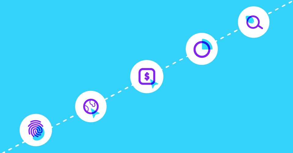
Are you curious about your business’s current stage?